For how much 1Ls care about grades, it’s a bit surprising how many students don’t seem to understand how the curve works. During first semester I heard fellow students commenting on the generous grading of some professors, which reflects a misunderstanding of just how the grading system operates. Most of us were not graded on a “real” curve in college; in many undergrad classes it is theoretically possible for the entire class to receive A’s. Most of the time the grade distribution in undergrad classes will look pretty normalized though; lots of B’s, fewer A’s and C’s, and very few D’s, F’s and A+’s. However in law school the curve is “forced” such that regardless of how phenomenally (or poorly) the class performs, the number of letter grades remains static. I am not math inclined by any means, but hopefully I remember enough from my introductory statistics courses in college to explain it.
How Loyola Law Grades:
The student handbook states: “All first year courses, with exception of Legal Research and Writing, will have a mandatory mean of 81.00 and a mandatory standard deviation of 6.00” The numerical grade a student receives based on this system is then converted into the letter grade that the student ultimately receives. The raw score to letter grade conversion is also provided in the student handbook in the following chart:
Notice that the lower cut-off is 55 points; this is so if you bomb a class it will not completely wreck your GPA.
The Normal Curve:
The "normal curve" is a probability distribution usually used for data that centers around an average. For example, height of adult males is pretty well characterized by this probability distribution - most adult males are close to the average, and it becomes increasingly unlikely to find an individual who is significantly above or below the average height. This distribution is frequently used in academics - for exams most student scores are centered around the average, with few students significantly above or below the average. A normal curve is often depicted like this:
“Mean score” represents the average, and the SD indicates standard deviation. As you can see the majority (34% + 34% = 62%) of grades fall within one standard deviations from the average. Some students will fall into the area representing two standard deviations; 14% of students will score better, 14% worse, representing 28% of total students. Finally, some students will do exceptionally well or conversely, not so well. These students are 3 standard deviations away, and fall within the left and right edges of the curve. 2% of students will be on the good end of this, 2% of students will be on the failing side, for a total of 4% students who are 3 standard deviations from the average. In sum, roughly 2/3 of students will be in the middle section, about 1/3 will be a bit better or worse than the majority, and a minority do exceptionally well (2%), or extremely poorly (2%).
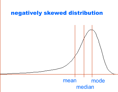
Professors often do not grade on a 55-100 scale, which means whatever scoring system professors use will be converted to the 55-100 point standard, and even if the distributions of scores is not normal (ie, does not look like a bell curve) it will be forced into a bell curve. Obviously the implications of this are pretty unfair. In a situation where there are more higher grades than lower grades the actual grade distribution will look more like this:

This could imply that that the students in the class are smarter, studied harder, etc (or could imply that the exam was too easy), but the actual distribution of grades will still be forced into a normal curve. It does work to our advantage as well, if the distribution is skewed the opposite way (eg, many people did horribly, not as many scored above the average) The distribution of grades is still forced into a normal curve so what would have been a terrible grade is not so bad anymore!
Putting it all together:
The following chart illustrates a normal distribution with a mean of 81 and standard deviation of 6. The grade cutoff points have been added, as represented by the red lines. The percentages in orange indicate what proportion of the class will receive the corresponding letter grade.
The implications of this chart are pretty straight forward: if your letter grade falls on one of the tail ends of the distribution you did very well or very poorly compared to your classmates. Even more importantly, this means that as far as grading goes, there is no such thing as a “nice” or “mean” professor. They cannot give more A-'s, B+’s, etc as grades must comport to the restrictions of the curve. The little economist in all of us should keep the realities of the law school curve in mind when deciding how much to study. How many additional hours of work will it take to put you in that top 10%? Furthermore, as many of us have undoubtedly learned already: your efforts hardly correspond to your grade. We all try hard, but the reality is very few of us will receive the grade we believe is deserved. As such, I don’t feel too bad taking time away from the endless tedium of outlining to write for http://boredinclubrain.blogspot.com/ .


No comments:
Post a Comment